#tidyTuesday 2/15/2022, W.E.B Dubois Challenge
For this tidy tuesday, the challenge is to recreate an original data visualization from W.E.B Du Bois. I thought I would walk through my process for recreating Challenge 2.
Here is the goal:

Original
library(curl)
library(tidyverse)
library(ggtext)


sysfonts::font_add_google(name = "Public Sans", "Public")
showtext::showtext_auto()

data <- read_csv("https://raw.githubusercontent.com/ajstarks/dubois-data-portraits/master/challenge/2022/challenge05/data.csv") %>%
        janitor::clean_names()
ggplot(data = data, mapping = aes(x = free, y = year))+
geom_point()+
xlim(0, 3)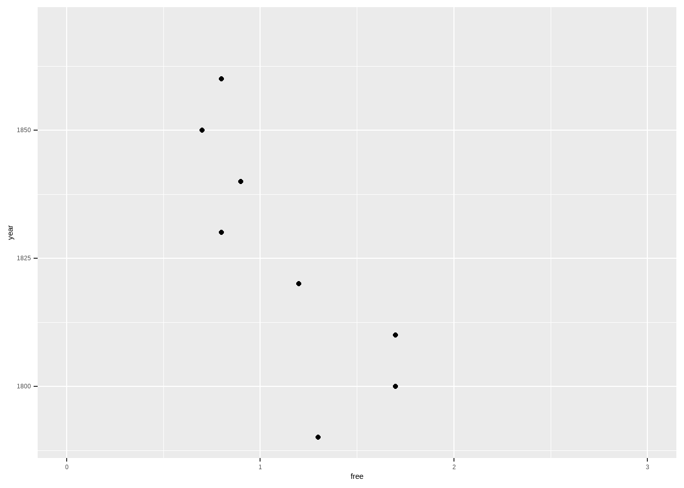
So the goal will eventually be shade both halfs of graph using a polygon, but we need to get everything set up first.
data <- data %>%
        add_row(year = 1863, slave = 0, free = 3)

ggplot(data = data, mapping = aes(x = free, y = year))+
        geom_point()+
        scale_y_reverse(n.breaks = nrow(data), expand = c(0,0))+
        scale_x_reverse(expand = c(0,0))+
        coord_cartesian(xlim = c(3,0))+
        geom_path()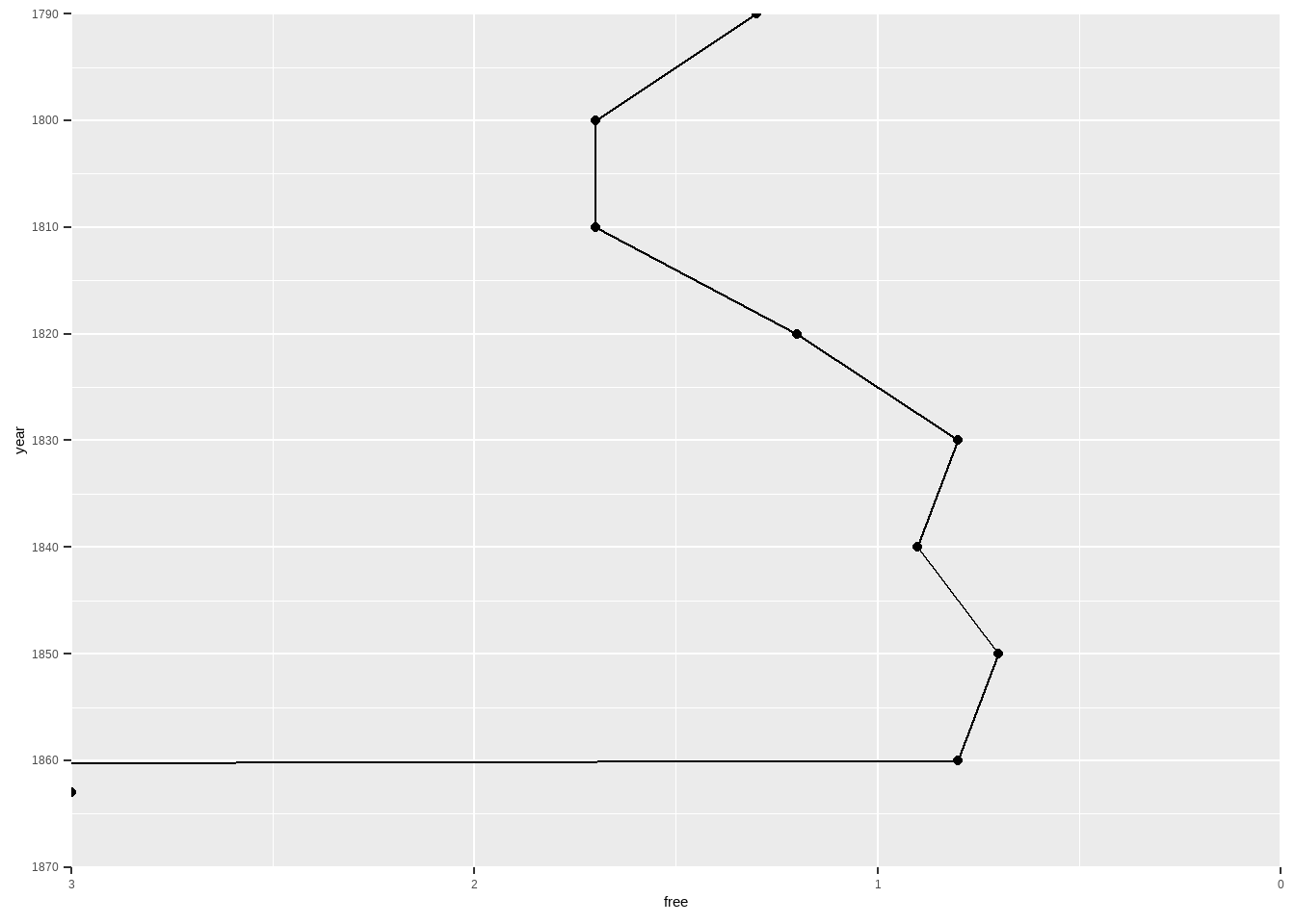
This is really great, and we are getting pretty close to the final product, but there’s a real issue of filling in either side. This can be solved by using geom_polygon instead of geom_path.
data <- data %>%
        arrange(desc(year))

data_slave <- tibble(year = data$year, free = 3)  %>%
        arrange(desc(free), year)

data_slave <- bind_rows(data_slave, data) %>%
        select(-c(slave))


data_free <- tibble(year = data$year, free = 0)  %>%
        arrange(desc(free), year)

data_free <- bind_rows(data_free, data) %>%
        select(-c(slave))
Sidenote, this was a major pain. geom_polygon expects the points in a very specific way, and it took 45 minutes of tinkering to figure out how to make it work.
ggplot(data = data, mapping = aes(x = free, y = year))+
        geom_point()+
        scale_y_reverse(n.breaks = nrow(data), expand = c(0,0))+
        scale_x_reverse(expand = c(0,0), position = "top",
                        label = c("", "1%", "2%", "3%"))+
        coord_cartesian(xlim = c(3,0)) +
        geom_polygon(data = data_slave, fill = "#10100e", color = "white")+
        geom_polygon(data = data_free, fill = "#d22b49", color = "white") +
        theme(aspect.ratio = 16/8)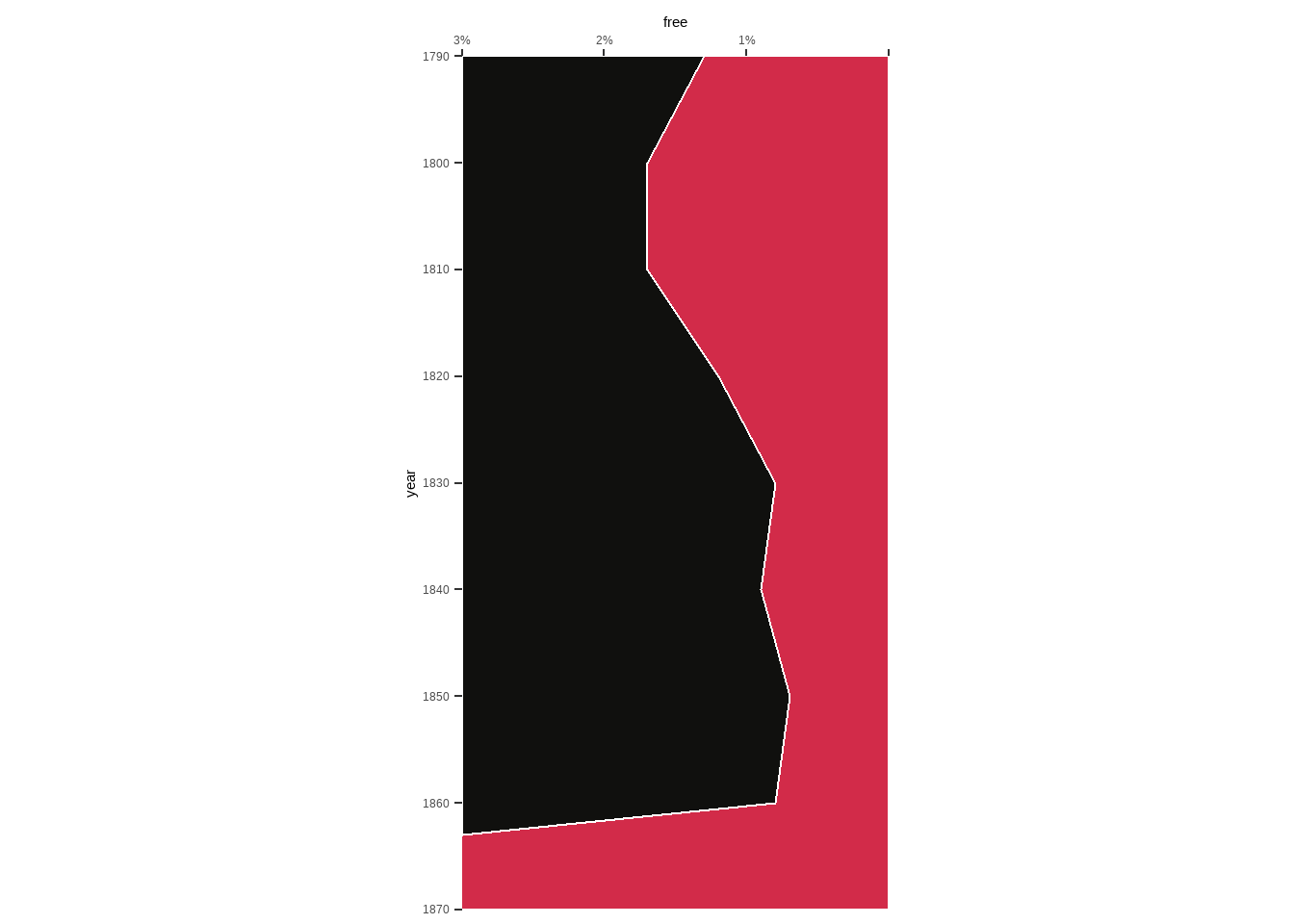
This is getting very close to the goal now. Let’s get the second y axis up and running.
label2 <- data %>%
        arrange(year) %>%
        select(free) %>%
        slice(-9) %>%
        mutate(free = as.character(free)) %>%
        mutate(free = if_else(free == "1.3", "1.3%", free),
               free = if_else(free == "100", "100%", free))


year2 <- data %>%
        arrange(year) %>%
        select(year) %>%
        slice(-9) %>%
        mutate(year)

breaks <- bind_cols(year2, label2)


ggplot(data = data, mapping = aes(x = free, y = year))+
        geom_point()+
        scale_y_reverse(n.breaks = nrow(data), expand = c(0,0),
                        sec.axis = dup_axis(breaks = breaks$year, labels = breaks$free)) +
        scale_x_reverse(expand = c(0,0), position = "top",
                        label = c("", "1%", "2%", "3%"))+
        coord_cartesian(xlim = c(3,0)) +
        geom_polygon(data = data_slave, fill = "#10100e", color = "white")+
        geom_polygon(data = data_free, fill = "#d22b49", color = "white") +
        theme(aspect.ratio = 16/8)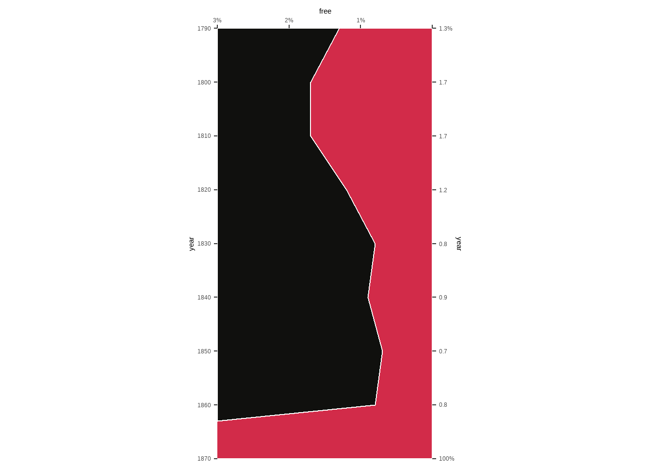
And with a few final changes to color, we have a finished product!
ggplot(data = data, mapping = aes(x = free, y = year))+
        geom_point()+
        scale_y_reverse(n.breaks = nrow(data), expand = c(0,0),
                        sec.axis = dup_axis(breaks = breaks$year, labels = breaks$free)) +
        scale_x_reverse(expand = c(0,0), position = "top",
                        label = c("", "1%", "2%", "3%"))+
        coord_cartesian(xlim = c(3,0)) +
        geom_polygon(data = data_slave, fill = "#10100e", color = "#e1d2c1")+
        geom_polygon(data = data_free, fill = "#d22b49", color = "#e1d2c1") +
        labs(title = "**SLAVES AND FREE NEGROS**",
             subtitle = "<span>Percent<br>of                            <br>Free Negros</span>")+
        geom_hline(data = breaks, aes(yintercept = year), color = "#e1d2c1") +
        theme(aspect.ratio = 16/8,
              axis.ticks.y = element_blank(),
              axis.title.y = element_blank(),
              axis.title.x.top = element_blank(),
              axis.text.x.top = element_text(size = 15),
              axis.text.y.right = element_text(size = 15),
              axis.text.y.left = element_text(size = 18),
              plot.subtitle = element_markdown(hjust = 1, vjust = 2, size = 15),
              plot.title = element_markdown(hjust = .45, size = 20, family = "Public"),
              plot.background = element_rect(color = "#e1d2c1", fill = "#e1d2c1"))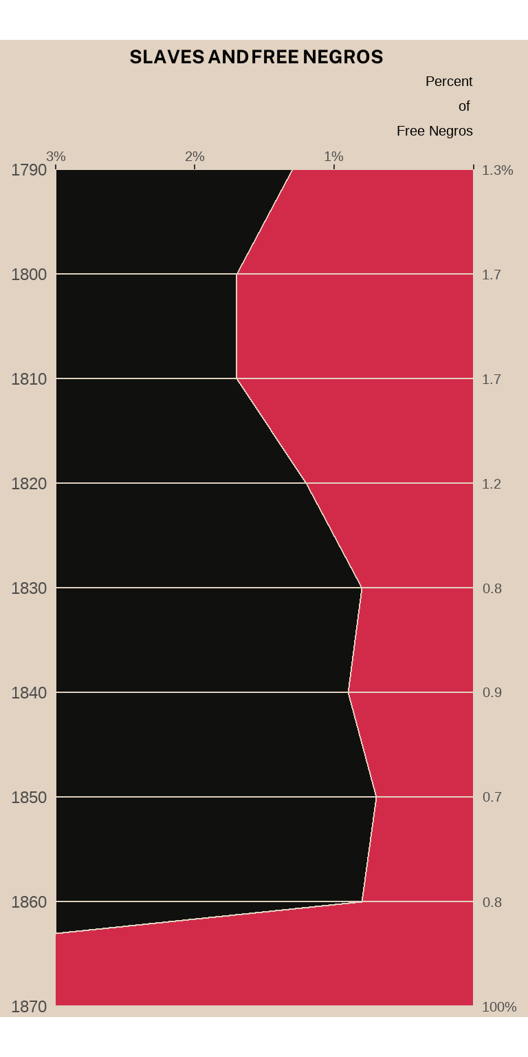

Original