#tidytuesday 2/22/22, The Freedom index and misleading visualization
This weeks tidy tuesday includes the dataset of the Freedom index produced by the Freedom House and the UN.
One of the included visualizations kind of struck me the wrong way.

Included Visualization
The y axis only goes from 85 to 100, and tells the story about how the United States’ freedom is very quickly eroding. While this does tell a story, it certaintly isn’t the entire story.
library(tidyverse)
library(ggthemes)
data <- tidytuesdayR::tt_load("2022-02-22")##
## Downloading file 1 of 1: `freedom.csv`variable class description country character Country Name year double Year CL double Civil Liberties PR double Political rights Status character Status (Free F, Not Free NF, Partially Free PF) Region_Code double UN Region code Region_Name character UN Region Name is_ldc double Is a least developed country (binary 0/1)
new_data <- data[[1]]

skimr::skim(new_data)| Name | new_data |
| Number of rows | 4979 |
| Number of columns | 8 |
| _______________________ | |
| Column type frequency: | |
| character | 3 |
| numeric | 5 |
| ________________________ | |
| Group variables | None |
Variable type: character
| skim_variable | n_missing | complete_rate | min | max | empty | n_unique | whitespace |
|---|---|---|---|---|---|---|---|
| country | 0 | 1 | 4 | 52 | 0 | 193 | 0 |
| Status | 0 | 1 | 1 | 2 | 0 | 3 | 0 |
| Region_Name | 0 | 1 | 4 | 8 | 0 | 5 | 0 |
Variable type: numeric
| skim_variable | n_missing | complete_rate | mean | sd | p0 | p25 | p50 | p75 | p100 | hist |
|---|---|---|---|---|---|---|---|---|---|---|
| year | 0 | 1 | 2007.56 | 7.49 | 1995 | 2001 | 2008 | 2014 | 2020 | ▇▇▇▇▇ |
| CL | 0 | 1 | 3.37 | 1.87 | 1 | 2 | 3 | 5 | 7 | ▇▃▃▃▃ |
| PR | 0 | 1 | 3.41 | 2.18 | 1 | 1 | 3 | 6 | 7 | ▇▂▂▂▅ |
| Region_Code | 0 | 1 | 72.53 | 68.64 | 2 | 2 | 19 | 142 | 150 | ▇▁▁▁▇ |
| is_ldc | 0 | 1 | 0.24 | 0.42 | 0 | 0 | 0 | 0 | 1 | ▇▁▁▁▂ |
library(cowplot)


mean_freedoms <- new_data %>%
        group_by(year) %>%
        summarise(civil_liberties = mean(CL), political_rights = mean(PR)) %>%
        pivot_longer(cols = c(civil_liberties, political_rights), names_to = "measure", values_to = "value") %>%
        filter(year >= 2008)


plt1 <- ggplot(data = mean_freedoms) +
        geom_line(mapping = aes(x = year, y = value, color = measure)) +
        scale_y_reverse()+
        scale_x_continuous(breaks = seq(min(mean_freedoms$year), max(mean_freedoms$year), by = 1))

plt2 <- ggplot(data = mean_freedoms) +
        geom_line(mapping = aes(x = year, y = value, color = measure)) +
        scale_y_reverse() +
        scale_x_continuous(breaks = seq(min(mean_freedoms$year), max(mean_freedoms$year), by = 1))+
        ylim(7, 1)

cowplot::plot_grid(plt1, plt2, nrow = 2, ncol = 1)
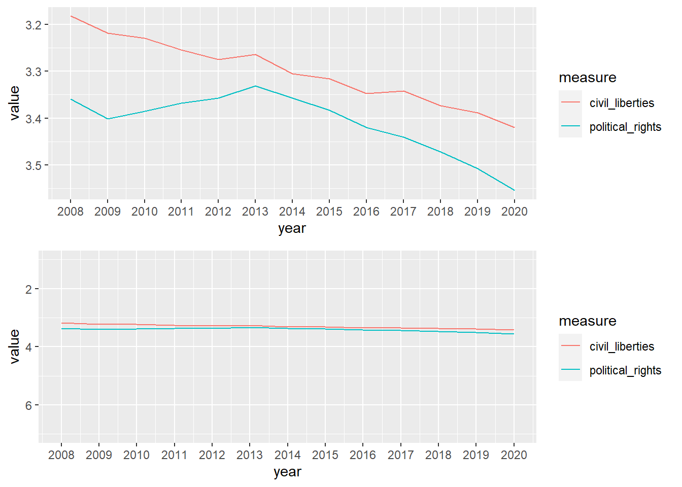
Compare the top graph, where the y axis limits were auto-applied by ggplot2, and the bottom graph, where the entire range is represented.
The top graph paints a disturbing picture. Civil liberties and political rights are tanking! We need immediate intervention! However, the bottom graph paints the fuller picture. Civil liberties and political rights are falling, however the progression is much slower. Something should be done, but we may have some more time to do something about it.
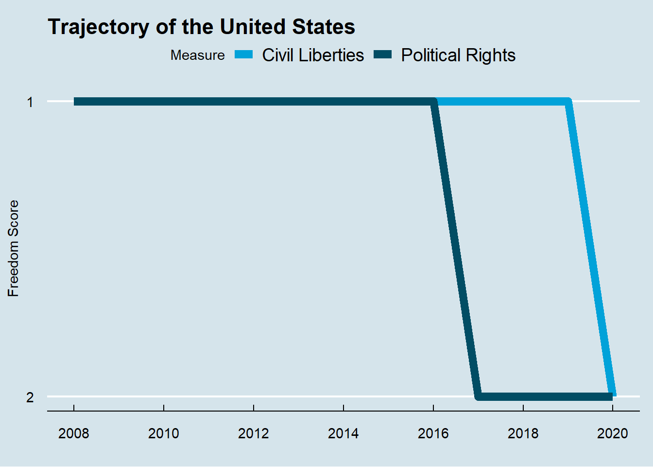
So now, the goal is simple: let’s replicate the original graph with appropriate axis, with the data we have.
us <- new_data %>%
        filter(country == "United States of America") %>%
        group_by(year) %>%
        summarise("Civil Liberties" = mean(CL), "Political Rights" = mean(PR)) %>%
        pivot_longer(cols = c("Civil Liberties", "Political Rights"), names_to = "measure", values_to = "value") %>%
        filter(year >= 2008)


ggplot(data = us)+
        geom_line(mapping = aes(x = year, y = value, color = measure), size = 3) +
        scale_y_reverse(breaks = seq(1, 7, by = 1), labels = seq(1, 7, by = 1)) +
        scale_x_continuous(breaks = seq(min(us$year), max(us$year), by = 2))+
        theme_economist()+
        scale_color_economist("Measure")+
        labs(title = "Trajectory of the United States")+
        xlab("")+
        ylab("Freedom Score")+
        theme(axis.title.y = element_text(vjust = 3))
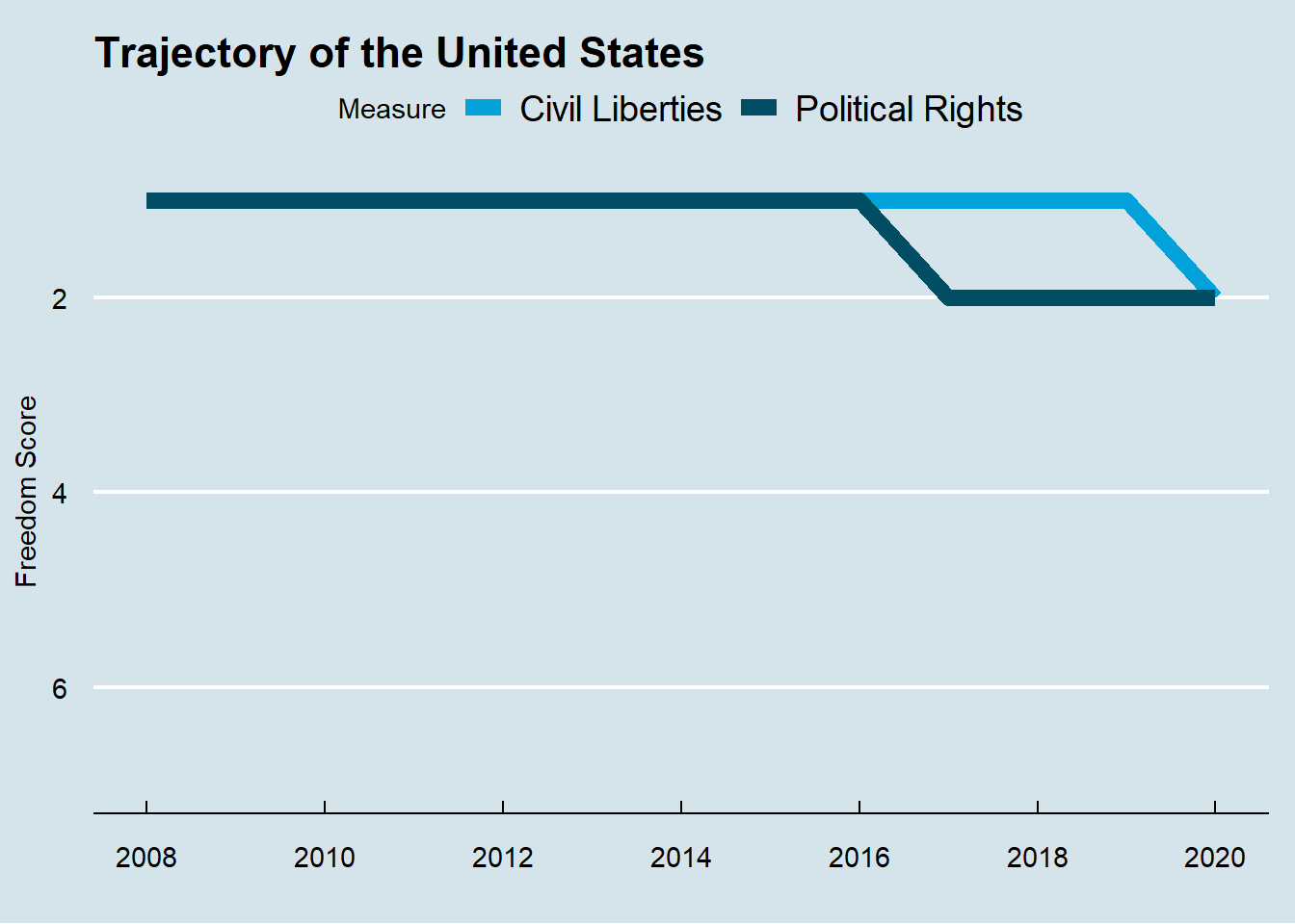
This is again, misleading. Let’s fix the y axis.
ggplot(data = us)+
        geom_line(mapping = aes(x = year, y = value, color = measure), size = 3) +
        scale_y_reverse(breaks = seq(1, 7, by = 1), labels = seq(1, 7, by = 1)) +
        scale_x_continuous(breaks = seq(min(us$year), max(us$year), by = 2))+
        theme_economist()+
        scale_color_economist("Measure")+
        labs(title = "Trajectory of the United States")+
        xlab("")+
        ylab("Freedom Score")+
        theme(axis.title.y = element_text(vjust = 3))+
        ylim(7, 1)
As we can see, the freedom is dropping, but not tanking.